STRATEGIC WEB DESIGN

Websites designed for how your customers actually use them.

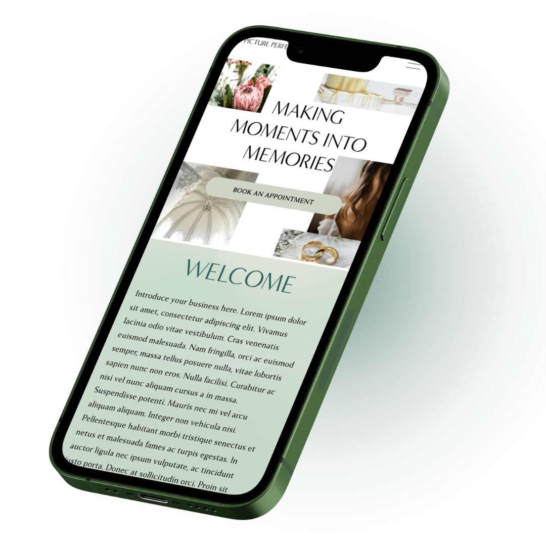
Mobile-first websites that are strategic, easy to use, and built to turn visitors into customers.

Mobile-first design approach

Built with sales strategy

A better experience for your customers

MOBILE DESIGN IS DIFFERENT

If my website fits on a phone, isn’t that good enough?

Your mobile website needs to do more than just fit on a smaller screen, it needs to work for how people use their phones.

DESIGNED FOR MOBILE

DESKTOP TO MOBILE

Small Text

Easy to read

Easy to tap

Harder to tap

Clear, focused content

Lots of scrolling

LET’S MAKE IT SIMPLE

How can I help you?

← swipe through →

FROM IDEA TO LIVE

Here is how designing your website works

01

We figure out a plan.

We start out with a conversation about your audience, you brand and what you need your website to do.

Goals

Pages

Customers

Strategy

02

I make the design.

With a clear plan in place I design your website with strategy and mobile in mind. So it’ll work for your business.

Custom Design

Mobile First

Strategic Layout

Your Brand, Your Style

03

We try to break it.

Before it goes live, we test everything like a real user would- especially on mobile. We make sure it’s easy to use, works properly and is ready to impress.

Buttons & Links

Forms & Checkout

Mobile Experience

All the details

04

Yay! You’re live!

Your website is ready to go and you’ll have the support you need as you launch and grow.

THE PERSON BEHIND THE PIXELS

Okay, but who is actually building your website?

tap around to get to know me ♡